Table of Contents
One of the tricks to have a better Instagram feed is winning it with how you edit your photos. Thanks to Google play store, we have access to many photo editing applications that we can explore.
Of course, we’ll share with you our favorite app. It’s Adobe Lightroom for mobile—P.S not a paid promotion.
Adobe Lightroom allows you to consistently edit and apply presets to your photos. You can instantly copy and paste settings across multiple photos, which is what we really need for our feed.
Now, here are our top picks of photo editing styles that can surely make you slay your Instagram game.
The Matte Finish
This slightly hazy filter on images has taken the editing industry by storm. A matte finish creates a soft, but a not-so-sharp effect on your photo. Many portrait, lifestyle, and food photographers use this kind of effect as it is a quick way to add moodiness and a sense of drama to an image.
How to Create a Matte Effect
Using Adobe Lightroom, you can easily apply a matte finish using Tone Curve.
- Go to the edit panel and click Light.
- Open Curve.
- Drag the bottom left point of the graph upward against the left edge.
- Add additional points to the Curve and adjust it as needed to change contrast and lighting.
Light + Airy


If you noticed, many bloggers share the same look on their Instagram feed. It’s bright, light, and airy. Using this style creates eye-catching photos as it showcases creamy skin tones, soft hues, and beautiful light colors. Light and airy images are basically more romantic and dreamy.
How to Achieve Light & Airy Photos
First of all, you must make sure your images are evenly lit to make it easier to apply this effect. As much as possible, avoid heavy and dark backgrounds. The best place and time to shoot is outdoors during the golden hour.
- Increase the exposure.
- Slightly lower the temperature to a cooler tone.
- Adjust the contrast accordingly just enough to make whites and blacks pop.
- Play with highlights and shadows.
- Tweak some areas of the photo for overly bright parts.
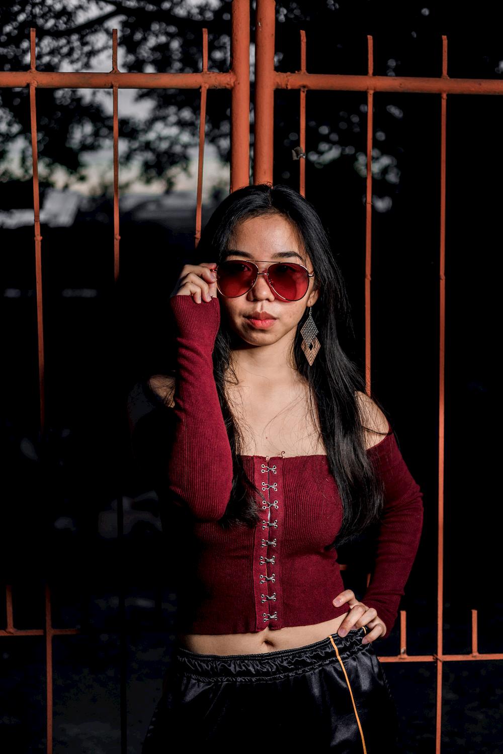
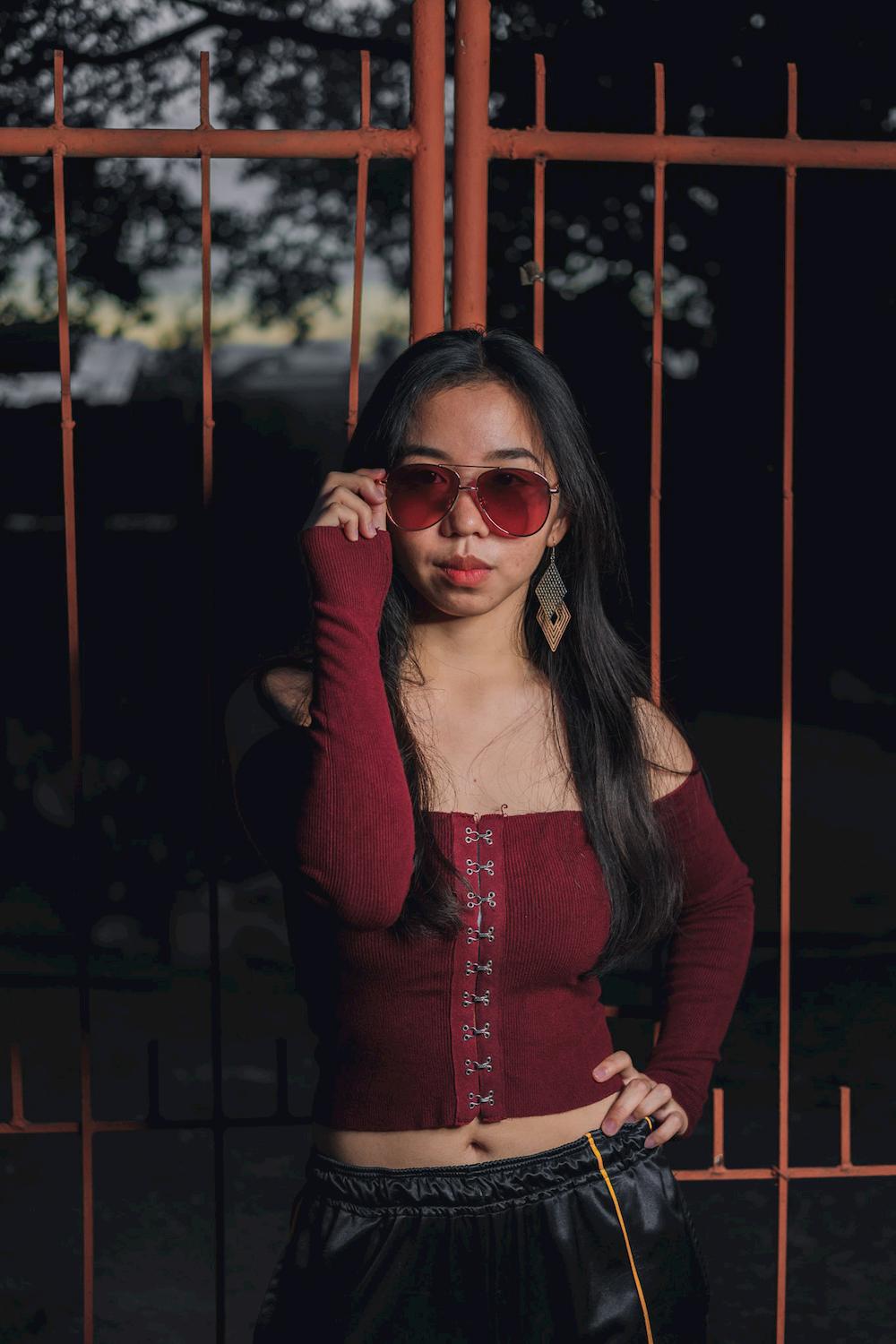
Muted Tones

The idea of muted tones is to simply mute some colors of your image instead of making them pop. It gives off a mood of perhaps like a dream or good memories. Muted tones are about desaturating some colors of your image. But, make sure to correctly choose the color that you want to eliminate. This will highly depend on the elements present in your image.
How to Make Muted Tones
Keep in mind that you don’t have to desaturate all colors as it will appear more grey. Experiment with your photo to achieve that perfect muted tone.
- Slightly decrease the value of Saturation;
- Or, you can also selectively choose a color by clicking on Color > Mix
- Adjust the Vibrance slider accordingly for the muted colors.
- Play with brightness and contrast.
The Monochromatic Look


Monochromatic may look old school, but this effect can give more impact on an image than those with vibrant colors. Don’t confuse monochromatic with the classic black and white, though. Black and white editing styles are shading the whites and blacks of a photo, while monochromatic shades only one color instead of several colors.
How to Accomplish a Monochromatic Look
Creating a monochromatic effect on your images is easy. Simply follow these steps.
- Make simple tone and exposure corrections.
- Apply the Monochromatic effect. You can make use of Lightroom’s profiles.
- Adjust contrast accordingly.
- Boost your photo’s clarity or dehaze.
- Add a little grain if desired.
- Use vignette to add more impact to your image.
Soft Earthy Tones

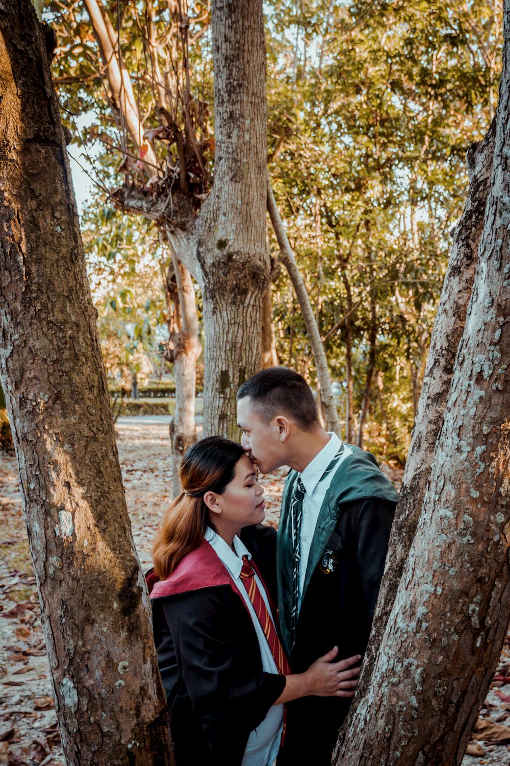
One of the ways to make your photos appear dreamy is through soft earthy tones. If you are one who loves the sight of deep reds, burnt oranges, browns, forest greens, and who is in love with the Autumn season, then this editing style is for you. Soft earthy tones are perfect for your outdoor photos.
How to Produce Photos with Soft Earthy Tones
Editing your photos into a soft earthy tone is not as complicated as it seems. The key? The warmer, the better.
- Desaturate your photo subtly.
- Yellow and greens tend to be oversaturated in bright sunny photos, desaturate them until you achieve your desired tone.
- The auto white balance on your camera setting can make photos look cooler. So, adjust the temperature to a warmer color.
- Moving highlights up and shadows down can create a nice soft touch to your photos. However, this does not apply to all photos. Experiment with the setting.
- Play with the curves for better contrast.
- Don’t hesitate to try out the vignette effect.
Tips for Your Instagram Feed
Now that you already have ideas for your photos, it’s time to plan out on how you are going to pull everything off—from choosing the right photos to post to deciding what style to apply on your feed.
Consistency
A consistent feed is more aesthetically pleasing. Choose one theme for all of your photos. Whether you would rather go for earthy tones, light and airy photos, muted and matted look, set your own mood and soul for your Instagram feed.
Transition
Maybe you are tired of your theme or you want something new. Then change a theme! Yes, that’s right. You can change a theme for your feed without breaking the rule above. Make sure to choose another theme that still complements your first theme. Perhaps you can post at least 5 rows of the same theme then transition to your next. The most important thing is you must have complete rows of photos with the same theme. Still, consistency is key.
Aesthetics
Showing everyone your beautiful and handsome faces might be ideal. However, never forget the aesthetics. Break the trend of posting portrait photos. Let your followers see some wonderful photos of the cafe you just visited, the beach where you enjoyed with your friends, or probably just the view from your room!
Preview
Don’t you know? There is an app that allows you to preview what your Instagram feed would look like once you post your set of photos. This app is built to plan and design your Instagram before posting them. You can rearrange your photos to make sure one photo looks good beside the other, schedule your posting, find trending hashtags, and more!
Congratulations! You are ready to make your Instagram feed goals happen!
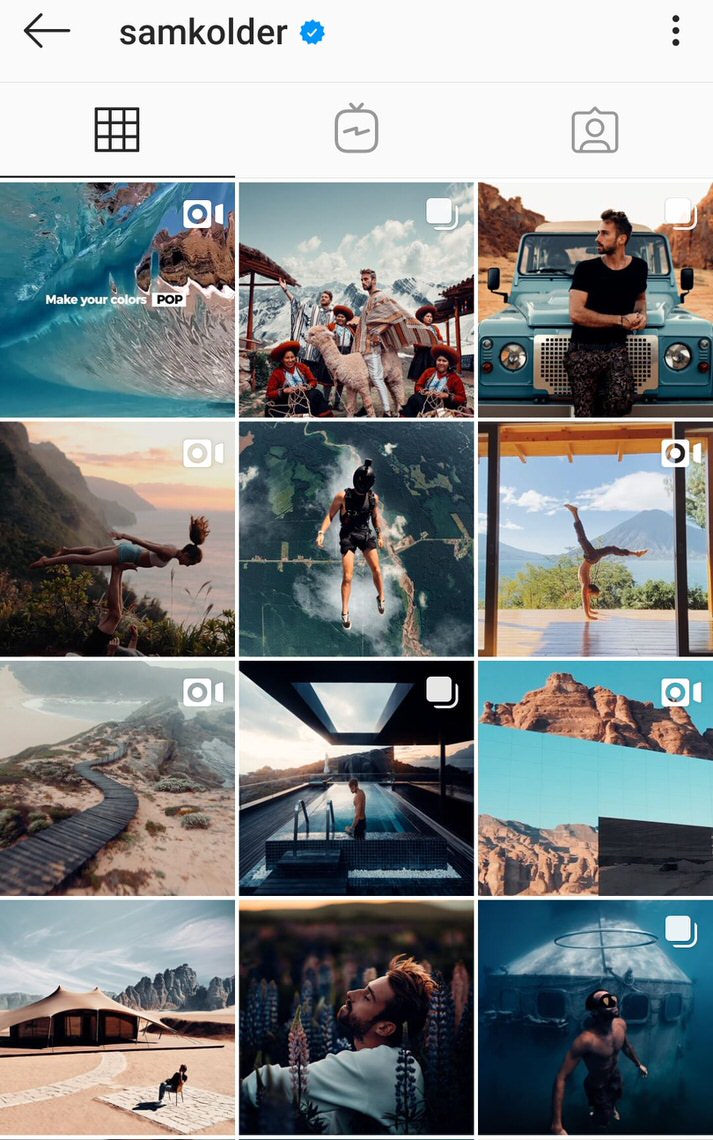
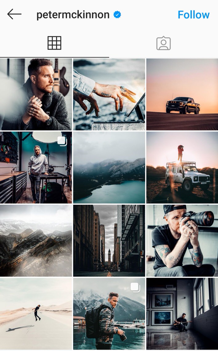
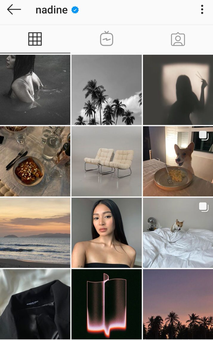
Instagram Feed Inspirations
Sam Kolder (@samkolder)
Peter McKinnon (@petermckinnon)
Nadine Lustre (@nadine)
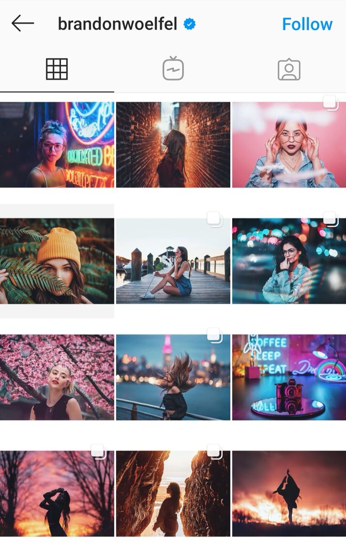
Brandon Woelfel (@brandonwoelfel)